
Responsive Design Optimizing User Experience Across Devices
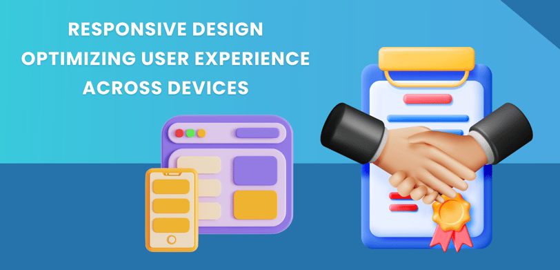
Responsive design ensures your website provides an optimal viewing experience across all devices by using flexible grids, fluid images, and media queries. This approach enhances user satisfaction, improves engagement, and simplifies site maintenance by adapting seamlessly to various screen sizes and orientations.

In today’s digital landscape, users access websites and applications from a multitude of devices, including smartphones, tablets, laptops, and desktops. With such a diverse array of screen sizes and resolutions, ensuring a seamless and engaging user experience has never been more crucial. This is where responsive design comes into play.
Responsive design is a web development approach aimed at crafting websites and applications that provide an optimal viewing experience across all devices. By adapting to various screen sizes and orientations, responsive design ensures that users have a consistent and enjoyable experience, regardless of how they access your site. In this blog post, we’ll explore the principles of responsive design and how to optimize user experience across different devices.
1. Understanding Responsive Design
What is Responsive Design?
Responsive design is a technique that uses flexible grid layouts, fluid images, and media queries to create web pages that automatically adjust to fit the screen size and orientation of the device being used. The goal is to provide a user-friendly experience without the need for separate versions of a website for different devices.
Why It Matters:
With mobile internet usage surpassing desktop usage in recent years, responsive design is more important than ever. It ensures that your website is accessible and functional on any device, which is critical for user satisfaction and engagement.
2. Key Principles of Responsive Design
Fluid Grid Layouts
Fluid grids use relative units like percentages instead of fixed units like pixels to create flexible layouts that adjust based on the screen size. This allows elements on the page to scale proportionally, ensuring that content remains well-organized and readable regardless of the device.
Flexible Images
Images in a responsive design are sized to fit within their containing elements. This means that images will scale up or down to match the dimensions of the viewport, avoiding issues with images appearing too large or too small on different devices.
Media Queries
Media queries are a fundamental part of responsive design, allowing designers to apply different styles based on the device’s characteristics, such as screen width, height, and orientation. By using media queries, you can create breakpoints in your design to adjust the layout and content for optimal viewing on various devices.
3. Designing for Different Devices
Smartphones
On smartphones, space is limited, so it’s crucial to prioritize content and simplify navigation. Use larger touch targets, avoid clutter, and ensure that key information is easily accessible. Vertical scrolling should be smooth, and ensure that text is legible without requiring zooming.
Tablets
Tablets offer more screen real estate than smartphones but are still touch-based. Optimize for both portrait and landscape orientations, and consider using a multi-column layout that adapts to the screen size. Interactive elements should be easy to tap and navigate.
Laptops and Desktops
For larger screens, you have more flexibility in layout and design. Utilize the extra space to provide a richer experience with multiple columns, detailed content, and complex navigation options. Ensure that your design scales well and that the user experience remains consistent.
4. Performance Considerations
Fast Loading Times
Responsive design is not just about appearance; it’s also about performance. Optimize images and other media to reduce loading times across all devices. Implement lazy loading for images and asynchronous loading for scripts to enhance speed.
Mobile-Friendly Navigation
Navigation on mobile devices should be straightforward and easy to use. Consider using a hamburger menu or a collapsible navigation bar to save screen space while still providing access to all important sections of your site.
Touchscreen Interactions
Ensure that all interactive elements, such as buttons and links, are easy to tap on touchscreen devices. Avoid small or closely spaced elements that could be difficult for users to interact with.
5. Testing and Iteration
Cross-Device Testing
Testing your responsive design across various devices and browsers is essential to ensure consistency and functionality. Use emulators and real devices to check how your site performs and appears on different screen sizes and resolutions.
User Feedback
Gather feedback from users to identify any issues they encounter and areas for improvement. User testing can provide valuable insights into how your responsive design is performing in real-world scenarios.
Continuous Improvement
Responsive design is an ongoing process. Regularly update and refine your design based on user feedback, performance data, and emerging best practices to ensure that your site continues to provide an optimal user experience.
6. The Benefits of Responsive Design
Improved User Experience
A well-implemented responsive design enhances the user experience by providing a consistent and enjoyable interaction across all devices. Users are more likely to stay on your site and engage with your content if they can easily navigate and read it on their device of choice.
Increased Reach and Engagement
Responsive design helps you reach a broader audience by ensuring that your site is accessible to users on any device. This can lead to higher engagement rates, increased conversions, and improved overall performance.
Simplified Maintenance
Maintaining a single responsive website is more efficient than managing separate sites for different devices. It simplifies updates, reduces maintenance costs, and ensures that all users have access to the same content and features.
Conclusion:
In an era where users access websites from a multitude of devices, responsive design is essential for providing a seamless and engaging user experience. By focusing on fluid grid layouts, flexible images, and media queries, you can create a website that adapts to any screen size and orientation.
Designing for different devices, optimizing performance, and continuously testing and improving your responsive design will help you deliver a consistent and enjoyable experience for all users. Embrace responsive design to enhance user satisfaction, expand your reach, and simplify site maintenance. With the right approach, you can ensure that your website remains accessible and effective across all devices, now and in the future.
© Copyright 2025 | Site build and Maintain by Step by Step Technologies | All Rights Reserved
Phone Number: +971 55 398 0434
Email: info@stepbysteptech.co
Address: Business Bay, Dubai, United Arab Emirates
Contact Details