
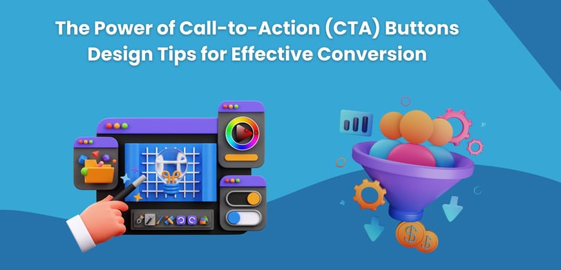
The Power of Call-to-Action (CTA) Buttons Design Tips for Effective Conversion
Call-to-Action (CTA) buttons are crucial for driving conversions in digital marketing. This post offers design tips, such as using clear messaging, contrasting colors, and strategic placement, to create effective CTAs that capture attention and boost user engagement.

In the world of digital marketing, call-to-action (CTA) buttons are one of the most important tools for driving conversions. Whether it’s encouraging users to sign up for a newsletter, download a resource, or make a purchase, an effective CTA button can be the difference between a visitor bouncing from your page and a customer completing an action. But what makes a CTA button truly powerful? It’s not just about having one—it’s about designing it in a way that captures attention and compels action. In this blog post, we’ll explore the power of CTA buttons and offer key design tips to help boost your conversion rates.
What is a CTA Button?
A Call-to-Action (CTA) button is a prompt on a webpage, email, or ad that encourages users to take a specific action. Phrases like "Buy Now," "Sign Up," "Learn More," or "Download" are common CTAs that aim to guide the user towards completing a desired goal. The design, placement, and messaging of the button are all critical in ensuring it resonates with users and motivates them to act.
CTA buttons may seem like small elements on the screen, but their influence on user behavior and conversion rates is massive. An ineffective CTA can leave potential customers confused or unmotivated, while a well-designed CTA can smoothly guide them to take the next step in their journey.
The Power of CTA Buttons
A CTA button serves as the last nudge in a user's decision-making process, acting as the final step that moves them from interest to action. A well-crafted CTA button does the following:
Grabs Attention:
With numerous distractions online, CTA buttons need to stand out visually and capture the user’s focus.
Guides the User:
It tells the visitor exactly what action to take, whether it's purchasing a product, signing up for an email list, or downloading a guide.
Increases Conversions:
Well-designed CTAs can drastically improve conversion rates, whether the goal is filling out a form, subscribing to a service, or completing a purchase.
Creates a Sense of Urgency:
A great CTA can instill a feeling of urgency or exclusivity, prompting users to act quickly rather than procrastinate.
However, designing the perfect CTA button requires more than just adding a few words to a colorful box. It’s a balance of psychology, visual design, and strategic placement. Here are some essential tips for crafting effective CTA buttons that convert.
Design Tips for Creating High-Converting CTA Buttons
1. Make Your CTA Clear and Action-Oriented
The message on your CTA button should be direct, clear, and action-oriented. Avoid generic terms like “Click Here” that don’t tell the user exactly what they’ll be getting. Instead, use strong action verbs that define the next step, such as:
“Start Your Free Trial”
“Get Instant Access”
“Download Now”
“Shop the Sale”
These phrases make the action obvious and enticing. The clearer the message, the more likely users will feel confident in their next step.
2. Use Contrasting Colors
One of the most critical design elements for a CTA button is its color. A button that blends into the background will be overlooked, so choose a color that contrasts with the surrounding elements of your webpage or email. The button should pop visually, grabbing the user’s attention immediately.
For example, if your website uses a blue or gray color scheme, a bright orange or green button would stand out. Conversely, if your design is bold and colorful, a white or black CTA might offer the contrast you need. Ensure the color contrast also aligns with your brand’s overall aesthetic for consistency.
3. Place Your CTA in High-Visibility Areas
Even the best-designed CTA button can fail if it’s not easily visible or well-placed. The location of your CTA can significantly affect its performance. Ideally, your CTA should be placed where it naturally aligns with the user’s journey through your content.
Some effective placement strategies include:
Above the Fold:
Ensure your main CTA button is visible as soon as the user lands on the page, without requiring scrolling.
At Logical Breakpoints:
Place CTA buttons after informative sections, such as following product descriptions, blog posts, or customer testimonials, where the user might naturally feel inclined to take action.
Repeating Throughout:
Depending on the length of your content, it’s helpful to include multiple CTA buttons in various strategic locations, giving users several opportunities to engage.
4. Use Size to Your Advantage
Size matters when it comes to CTA buttons. A button that’s too small may go unnoticed, while one that’s too large could feel overwhelming or out of place. The button should be large enough to stand out, but still fit naturally within the flow of the content.
When designing for mobile, make sure the button is touch-friendly, meaning it’s big enough to be easily tapped without accidentally hitting other elements.
5. Create a Sense of Urgency
A CTA button that creates a sense of urgency can significantly boost conversions. Phrases like “Limited Time Offer,” “Shop Now Before It’s Gone,” or “Claim Your Discount Today” encourage users to act quickly, reducing the likelihood that they’ll leave the page and forget about your offer.
Urgency works because it taps into FOMO (fear of missing out), compelling users to take advantage of the opportunity before it’s too late. Use this tactic sparingly and ensure the urgency is genuine to avoid desensitizing users.
6. Test Your CTAs for Performance
One of the most critical elements of successful CTA buttons is continual testing. What works for one audience may not work for another, so it’s essential to run A/B tests on different CTA designs, messages, colors, and placements. By testing variations, you can determine which CTA button yields the highest conversion rates.
When conducting A/B testing, change one element at a time—such as color, copy, or size—so you can clearly see which adjustment has the greatest impact.
7. Incorporate a Hover Effect
Adding a subtle hover effect to your CTA button can make it feel interactive and dynamic. When users hover over the button, the slight animation or color change signals that the button is clickable, prompting them to take action.
Hover effects can include color shifts, shadow highlights, or slight enlargements. These effects draw attention without distracting the user from the main action.
Common CTA Mistakes to Avoid
While it’s important to focus on best practices, knowing what to avoid is equally important. Here are some common mistakes that can reduce the effectiveness of your CTA buttons:
Too Many CTA Options:
If you present users with too many choices, they may feel overwhelmed and not take any action at all. Stick to one primary CTA per page or section to keep the focus clear.
Unclear Value Proposition:
If users aren’t sure what they’ll get when they click your CTA, they’re less likely to take the next step. Ensure the value of clicking the button is immediately obvious.
Ignoring Mobile Users:
CTA buttons that aren’t optimized for mobile will lead to poor conversion rates. Always test your CTA buttons across devices to ensure they’re easy to tap and interact with on mobile screens.
Conclusion
Call-to-action buttons may be small in size, but they hold immense power in driving conversions and engaging users. By crafting clear, visually striking, and strategically placed CTA buttons, you can guide users through your site or campaign with ease, improving their overall experience and encouraging meaningful actions.
Remember, the key to an effective CTA button lies in balancing compelling messaging with smart design choices. Keep testing, optimizing, and refining to ensure your CTA buttons are truly working for you and driving the results you want.
© Copyright 2025 | Site build and Maintain by Step by Step Technologies | All Rights Reserved
Phone Number: +971 55 398 0434
Email: info@stepbysteptech.co
Address: Business Bay, Dubai, United Arab Emirates
Contact Details