
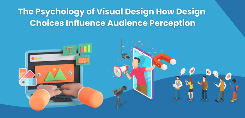
The Psychology of Visual Design How Design Choices Influence Audience Perception
The psychology of visual design explores how elements like color, typography, shapes, and layout impact audience perception and emotional response. This blog highlights key design principles that influence how people interact with visuals, helping brands create more engaging and effective designs.
Visual design goes far beyond aesthetics; it taps into the psychology of how people perceive and process information. Every element of a design, from colors and fonts to layouts and shapes, plays a vital role in influencing the audience’s perception and emotional response. Understanding the psychology behind design choices allows businesses, marketers, and designers to create visuals that resonate with their target audience, evoke the right emotions, and drive desired actions.
In this blog post, we’ll explore the psychology of visual design and how specific design choices influence the way audiences interact with content.
1. The Power of Color Psychology
Color is one of the most influential elements in visual design. Different colors evoke different emotions and reactions, and choosing the right color scheme can set the tone for how your audience perceives your brand or message.
Here’s how some common colors are perceived:
Red:
Often associated with energy, excitement, passion, and urgency. Red grabs attention and can stimulate emotions, making it a popular choice for call-to-action buttons or sales banners.
Blue:
Known for its calming and trustworthy qualities, blue is often used in corporate or tech designs. It conveys professionalism, stability, and reliability.
Green:
Green is linked to nature, health, and growth. It’s frequently used by brands focusing on sustainability or wellness and can create a sense of balance and peace.
Yellow:
Yellow radiates optimism, happiness, and warmth. However, overuse of yellow can lead to feelings of anxiety or frustration, so it’s best used in moderation.
Black:
Black conveys sophistication, luxury, and power. It’s often used in high-end or minimalist designs but can also appear bold and assertive.
Choosing the right color palette for your design requires a deep understanding of your audience and the message you want to communicate. The right colors can create an emotional connection, while the wrong ones can lead to misinterpretation.
2. Typography and Its Psychological Impact
Typography, or the style and appearance of text, significantly impacts how your audience perceives your content. Font choice and size can influence readability, emotions, and brand perception. There are three main types of fonts, each evoking different feelings:
Serif fonts:
Fonts with small lines or strokes attached to the ends of letters (e.g., Times New Roman) are seen as traditional, trustworthy, and formal. They’re often used by institutions like newspapers, universities, and law firms.
Sans-serif fonts:
Clean and modern, sans-serif fonts (e.g., Arial, Helvetica) are easier to read on screens and convey a sense of simplicity, minimalism, and efficiency. These fonts are popular in tech and modern brands.
Script and decorative fonts:
Script fonts mimic handwriting, while decorative fonts are more artistic and expressive. These types of fonts convey elegance, creativity, and uniqueness but should be used sparingly for headlines or logos due to readability concerns.
In addition to font type, typography hierarchy (the use of different font sizes, weights, and styles) plays a crucial role in guiding the viewer’s attention. A bold, larger headline immediately draws attention, while smaller body text communicates detailed information. Consistent and thoughtful typography choices help create a cohesive brand identity and a more engaging user experience.
3. The Influence of Shapes and Patterns
Shapes and patterns are another key element of visual design that can affect how people interpret a design. Each shape carries its own psychological connotations:
Circles:
Associated with unity, harmony, and inclusiveness, circles often evoke positive feelings. They’re frequently used in logos to create a sense of community, such as in social media platforms.
Squares and rectangles:
These shapes are seen as stable, trustworthy, and balanced. They provide structure and are often used in corporate branding or designs where order and professionalism are emphasized.
Triangles:
Triangles can suggest direction, power, or movement. When pointed upward, they create a sense of stability and ambition; when inverted, they evoke feelings of imbalance or risk.
Organic shapes:
Non-geometric, free-form shapes often resemble natural elements, creating a sense of warmth, spontaneity, and creativity. These shapes are commonly found in designs for wellness or artistic brands.
Patterns can either enhance the viewer’s experience or overwhelm it, depending on their complexity and repetition. Subtle patterns can add texture and depth to a design, while bold, repetitive patterns can be used to grab attention or emphasize a key area of the design.
Using shapes and patterns strategically helps establish visual harmony, communicate ideas nonverbally, and direct attention to key elements of a design.
4. Balance and Symmetry: Creating Visual Harmony
Balance in design refers to how visual elements are arranged on a page, ensuring that the composition feels stable and pleasing to the eye. There are two types of balance:
Symmetrical balance:
When elements are mirrored or evenly distributed across the design, it creates a sense of stability, order, and professionalism. Symmetry is common in traditional, corporate, or formal designs.
Asymmetrical balance:
This occurs when elements of different sizes or weights are placed unevenly but still achieve a balanced feel. Asymmetry creates visual interest, dynamism, and modernity. It’s often seen in more creative, innovative designs.
Whether you choose symmetry or asymmetry depends on the tone you want to convey. Symmetry might appeal to conservative or formal audiences, while asymmetry adds a contemporary, artistic flair that can engage more adventurous viewers.
Maintaining a well-balanced design keeps the viewer’s attention focused on the content, rather than creating confusion or a sense of imbalance that might cause them to lose interest.
5. Whitespace: The Art of Simplicity
Whitespace (also known as negative space) is the empty space around design elements, and it’s a powerful tool in visual design psychology. Whitespace doesn’t just give a design room to breathe; it also helps direct focus and improve comprehension.
The psychological effects of whitespace include:
Enhanced focus:
Designs with plenty of whitespace are easier to navigate because they give viewers a clear path to follow. It reduces cognitive overload, allowing the audience to focus on the key message.
Perception of luxury:
Brands that use ample whitespace in their designs, such as high-end fashion or tech companies, often convey a sense of sophistication and exclusivity.
A feeling of calm:
Spacing out elements creates a sense of calm and relaxation, making the design more inviting and less cluttered. In contrast, designs without enough whitespace can feel overwhelming and stressful.
Whitespace is particularly important in web design, where cluttered pages can drive users away. By incorporating sufficient whitespace, you create a cleaner, more inviting experience that encourages user engagement and retention.
6. Visual Hierarchy: Guiding the Viewer’s Eye
Visual hierarchy is the arrangement of design elements to prioritize the most important information first. By using size, contrast, and positioning, designers can influence the viewer’s path through the content.
Key aspects of visual hierarchy include:
Size:
Larger elements, such as headlines or images, naturally draw more attention. Using larger sizes for key messages helps guide viewers to what’s most important.
Contrast:
High contrast between elements, such as bold colors or fonts, can make a specific section stand out. This contrast creates visual interest and makes it clear where the viewer should focus their attention.
Positioning:
The placement of elements on the page also affects how they are perceived. Typically, audiences read from top to bottom and left to right (in Western cultures), so placing key messages in the top-left corner will naturally capture attention first.
Effective visual hierarchy ensures that the audience quickly understands the message without feeling lost or confused. It simplifies navigation and enhances the overall user experience.
Conclusion
The psychology of visual design is an essential component in creating meaningful and impactful designs. From color psychology to typography, shapes, and visual hierarchy, each design choice influences how your audience perceives and interacts with your brand. By understanding the psychological principles behind design, businesses and designers can craft visuals that not only attract attention but also foster emotional connections and drive action.
© Copyright 2025 | Site build and Maintain by Step by Step Technologies | All Rights Reserved
Phone Number: +971 55 398 0434
Email: info@stepbysteptech.co
Address: Business Bay, Dubai, United Arab Emirates
Contact Details